BW to Color
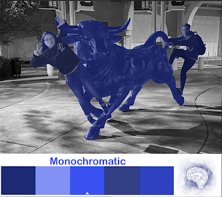

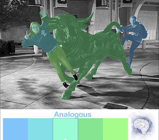

I used a picture I had of me and a friend along with a statue of a bull and thought it would be the perfect picture as there are multiple subjects that I could manipulate. Also I had the idea that by having more subjects the background would allow the changes to stand out more as I left it in Black and White compared to the bright colors that I input. Once having an idea of what I wanted to do I played a little with the color wheel chooser and saw maybe what colors and type of color combinations I would decide on. At the end I went with Monochrome since I wanted to see how I could work with one color with different shades and took it as a challenge to try and make each color kind of stand out form each other, yet still making sure it was clear that the picture had monochrome blue colors. Then I decided to go with Triad as my second choice, as I tried to choose colors that could compliment each other. And lastly for the thirst picture I did Analogous, which with the same idea in mind as Monochrome I wanted to play around with similar color options yet still have them each be spotligheted in a certain way, by separating them with subjects or parts of the body. I didn't have any trouble working with Photoshop as I had used it in the past before, but still was able to familiarize myself with it a bit more.
Dear Maria,
ReplyDeleteThis is really good and all the different colors you used worked out looking super cool. The way you added yourself into this picture was very clever because it looks so real, good job
Hi Maria, this project turned out very neat. I really like the monochromatic one and how all the the blues mesh together well. The only recommendation I have is that in the last one you missed your feet. Besides that, everything looks perfect.
ReplyDeleteThis project is awesome. The analogous color scheme definitely stood out to me. The way you selected parts of the image was done really well.
ReplyDeleteI really like the first BW to Color photo that you did because the blue really drowns it out and is a good contrast.
ReplyDelete