Sketches
B&W
Color
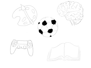
For my Logo assignment I began with five words that I that represented me or something that I am passionate about. Art was the first thing that I could think of as creativity and doing things such as painting and drawing are what make me happy and what I aspire to do as a career in the future; which is was made me choose to sketch a pallets and paint brush. Then I thought about soccer which is a sport that I love to play and drawing a soccer ball. Another thing that I consider to be one of my hobbies are video games, which I choose to portray by sketching a gaming controller. I also choose to consult one of my close friends to get an outside opinion of something that could signify my personality, from that I decided to draw an open book, as I am believed to be someone that is very open and understanding. Lastly I choose to draw a brain, since I always liked the way it symbolizes intelligence and knowledge, but can also signify what is inside someone’s thoughts.
With my sketches I then brainstormed on how I could come up with a logo that somehow showed who I am with simple shapes and images that are easy to make out. After some trial and error I ended up with the first Black and White logo that is shown above. I believe it is simple enough yet has a meaning that can be understood by combining the shape of the brain and the shape of a pallet. Once knowing what my logo would be I started to mess around with different colors that might look good with the logo. And the one that I think is the best and will be using for future projects is the light blue and yellow themed logo, as I like the way it is bright and fun yet not overly colorful and still simple that can be used in different sizes and places.
I didn’t have any problems in illustrator while working on my logo.
References


Maria, I love how your logo turned out. It is very intricate and executed great! I would've never thought of a brain and a palette to be similar. This logo ended up looking great. There are so many details in the brain portion of the logo that show you truly tried and succeeded.
ReplyDeleteHi Maria,
ReplyDeleteI think that your logos turned out really cool and flawless. I love the idea of having the palette inside of the brain. It looks like a cartoon you would find on the internet. I also like how you chose things that had meaning to you, makes the outcome much more interesting. Really nice job!
Hi Maria, I’m a big fan of these logos they are pretty much Stunning. They almost look like emojis on the phone to me
ReplyDeleteHey Maria! I really like what you did with your logo. It was very creative. The idea of having the palette inside the brain makes it look really cool. I also like how personal it is. Amazing job!
ReplyDeleteHey Maria! I really like your logo. It is very creative and I like how you had many ideas and put them all into one. Great Job!
ReplyDeleteHey Maria, I really enjoyed your logo, I find it very creative and different. The colors mix well with your logo. I really liked how you mixed everything into one. Good Job!
ReplyDeleteHi Maria! I really enjoy the design for this logo. The way you incorporated the brain as well as the art palette is super cool.
ReplyDelete