Self Portrait Poster
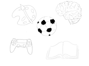
For my idea of a propaganda poster I started with this picture of me that showed by face clear.y but also allowed me to manipulate it enough to try and figure out what could work towards the post, such as the space in which the subject is in and the color scheme of the picture. The first idea that I had was to use the color that were found in early war propaganda posters, such as blue, red and white; these colors allow the poster to stand out and pop with simple colors. After figuring this out I proceeded to brain storm on what message I wanted to deliver in the poster. As an animation major I knew I wanted to do something that was close to creativity and something that could symbolize that and make it clear. I didn’t really have any sources and took inspiration from many different war posters; taking their color themes in mind.
Once actually starting to work on the poster in Illustrator, I kept in mind the strategy of using different layers to my advantage and how to make everything seem as cohesive as possible. Some issues I had were on getting the right angles for the face and hair.
To conclude I believe my goal of having a clear message that was still fun to look at was achieved. I used the colors I referenced from other propaganda posters in order to make my poster popped and used the spacing of the given dimensions to my advantage so the picture made sense with what I wanted to show.


Comments
Post a Comment