Posts

Final Portfolio

Image
  At the end of this class, I've learned to use different Adobe applications such as Illustrator, Photoshop, Indesign, and Dreamweaver. I've learned new skills in each individual software such as using code to create a drawing with Dreamweaver, along with using different tools in all of these that help work with a project a lot smoother. As I familiarized myself with the similar tools that reappeared throughout these I was able to understand how to do certain steps a lot easier. The toughest part was using illustrator as I was not familiar with anything like that in the past so it was the application we used that made me work harder to try and have a great end result. I believe that moving forward now if I need to do anything similar to what we have done in this class I will be able to work with these a lot better. 

Photoshop HW 2

Image
  I believe this image would be hard to photoshop myself into because the original subject that is in the picture which is Kendal Jenner, is actively touching the other person. Which I would think would be hard to work with since you would have to get the right lighting, position, angle, and not only that but make it look seamless enough that it doesn't look like you are not in the picture. This image gave me an idea for the Somewhere project as I am a soccer fan and I think I could photoshop myself into some kind of moment in a stadium while players are playing soccer. It is active enough that there are things I could interact with within the picture and enough lighting that I could integrate myself into the picture. This picture made me laugh as it is edited in a way in which it gives the image some sort of comical movement. As she is basically dropping the guy on her arms to the floor, not only that but the detail of making her arms be stretched out and his feet be on the bottom

BW to Color

Image
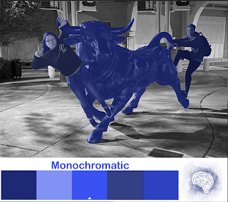
  I used a picture I had of me and a friend along with a statue of a bull and thought it would be the perfect picture as there are multiple subjects that I could manipulate. Also I had the idea that by having more subjects the background would allow the changes to stand out more as I left it in Black and White compared to the bright colors that I input. Once having an idea of what I wanted to do I played a little with the color wheel chooser and saw maybe what colors and type of color combinations I would decide on. At the end I went with Monochrome since I wanted to see how I could work with one color with different shades and took it as a challenge to try and make each color kind of stand out form each other, yet still making sure it was clear that the picture had monochrome blue colors. Then I decided to go with Triad as my second choice, as I tried to choose colors that could compliment each other. And lastly for the thirst picture I did Analogous, which with the same idea in mind

Logo Tag Brush

Image
  To make my tag brush I used the logo I created on Illustrator, which I made after brainstorming on something that could be used to encompass who I am in one image. I started with some sketches that I refined and made what it is now, the outline of a brain with a paint pallet inside. This signifies the way I think every day and how people might think of me as a creative person.  I took this logo and implemented it in Photoshop in order to make my tag brush, I started by adding it as embedded and then selecting around the logo and making an outline. After doing so I added the spray, scratch, and negative effects on top of it, which is what gave it the look of spray paint; with the main point in the middle and splatter surrounding it. The result is the tag brush containing the image of my logo. Lastly after creating the tag brush and opening a new document with a white background layer so the different colored tags would stand out. I played with different colors and their order and some

Photoshop HW 1

Image
under each video write 1-2 paragraphs if you think which tool/tools will be easy or hard to use, how you might use it and what you find interesting about the video. How to use Photoshop 2021 Tools If you click and hold a tool it will give you any additional preferences for that tool, which I believe is a way it will allow getting used to the tools faster. I believe the marquee tool is gonna be one of the most useful tools as it is able to select specific areas and choices to select things in whatever you are working on. I might probably use it when I might want to select certain details in a drawing or comic. Lasso tool is a little bit like the marquee tool in which it allows you to select things but also allows you to then have the subject selected while working on something on it, allowing the artist to change things while keeping something unchanged and selected. Those are the tools that I think are going to be the easiest to use, along with that I like the way in which the video cr

Logo

Image
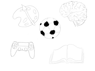
Sketches B&W Color For my Logo assignment I began with five words that I that represented me or something that I am passionate about. Art was the first thing that I could think of as creativity and doing things such as painting and drawing are what make me happy and what I aspire to do as a career in the future; which is was made me choose to sketch a pallets and paint brush. Then I thought about soccer which is a sport that I love to play and drawing a soccer ball. Another thing that I consider to be one of my hobbies are video games, which I choose to portray by sketching a gaming controller. I also choose to consult one of my close friends to get an outside opinion of something that could signify my personality, from that I decided to draw an open book, as I am believed to be someone that is very open and understanding. Lastly I choose to draw a brain, since I always liked the way it symbolizes intelligence and knowledge, but can also signify what is inside someone’s thoughts. 

Self Portrait Poster

Image
  For my idea of a propaganda poster I started with this picture of me that showed by face clear.y but also allowed me to manipulate it enough to try and figure out what could work towards the post, such as the space in which the subject is in and the color scheme of the picture. The first idea that I had was to use the color that were found in early war propaganda posters, such as blue, red and white; these colors allow the poster to stand out and pop with simple colors. After figuring this out I proceeded to brain storm on what message I wanted to deliver in the poster. As an animation major I knew I wanted to do something that was close to creativity and something that could symbolize that and make it clear. I didn’t really have any sources and took inspiration from many different war posters; taking their color themes in mind.  Once actually starting to work on the poster in Illustrator, I kept in mind the strategy of using different layers to my advantage and how to make everythin